Could it be as simple as just saying "that's the one"?!?!!
David Lee, Principal, Propellor Social Enterprise Advisors
Challenge
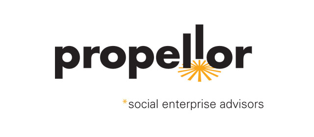
After developing the name "Propellor" we had to design the logotype or wordmark for this new consulting practice. Needless to say, we also avoided images of 3-bladed propellers, beanies, bull's eyes, etc.
Solution
The name suggests movement and the obvious direction that comes to mind is movement in a horizontal plane like a boat on the water. More importantly though, was the concept of upward mobility — the idea that this firm will help you get to the next level. Or in the case of start-ups, help you launch your new venture.
The primary font, Futura Bold, kept this logotype clean, strong and contemporary. The double 'L' gave us the opportunity to suggest a simple sequence — kind of a 2-frame animation — before and after lift-off. We applied a bit of perspective to a Zapf Dingbat for the launch-pad blast. This graphic solution is simple to reproduce in any medium.
That blast graphic also made a nice, simple visual connection to the subscript asterisk.
Results
This clean, bold logotype reproduces well at any size and in low-res media such as web and email signatures. It is simple to plot for signage and display graphics. The black and chrome yellow provide the maximum tonal contrast and highest energy colour combination — ensuring strong visual impact.