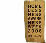
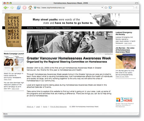
Website is pivotal in campaign to solve homelessness in BC
It’s wicked. I love it. Kicks ass.
Kirsten Garrison, City of Vancouver
Challenge
We designed the site as predominantly black & white, with sparse use of color to maintain a sombre tone for information about this serious problem. Here's Michelle Ninow's synopsis of our challenge and solution:
"Design HQ took on the challenging task of designing a website for Homelessness Awareness Week 2006. This process was overseen by a Co-ordinating Committee and as you can imagine, the expectations and directives were complex. We were attempting to integrate a number of components in one site and we were trying to get the feel of the whole thing just right. …we wanted a site that could provide a range of types of information and be easy to use. We also wanted to the site to be interesting enough that it would pull people in to explore more."
Solution
Michelle went on to say, "Ian and Kelly were completely responsive to our requests and created a website that was a key component of Homelessness Awareness Week. The site was visited by thousands of people, referenced throughout the week's events, and continues to be visited by people who want to learn more about homelessness in Greater Vancouver. Homelessness Awareness Week 2006 moved the issue of homelessness in Greater Vancouver into the spotlight. The website was a major contributor to the successes of our first year. I would not hesitate to refer Design HQ for other organizations that want to use a website as a social marketing tool and as an accompaniment to event planning."
Michelle Ninow
Regional Steering Committee on Homelessness