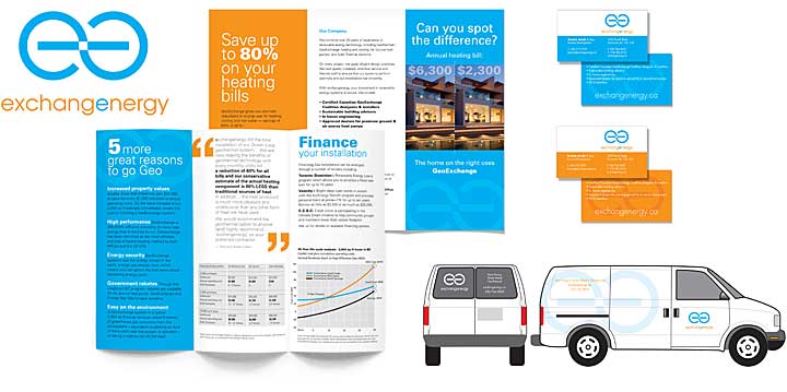
Hot/cool colour scheme is key component for this high-energy brand
Wow soooo good! I love the full colour options leaning towards the cyan front and back. Love the water mark. Think we could probably alternate between the cyan and orange front and back seasonally.
Andrea Dobbs, Communications Director
Challenge
Geoexchange systems have been described by the US EPA as the most energy efficient method of heating and cooling buildings. This prompted a key decision maker in the company to push for green in the branding.
Solution
It's tough to tell who's green washing their business these days and who is genuinely "green". Either way, "greening" your brand seems less important than reinforcing other key attributes and letting the green ones come along for the ride. Since geoexchange provides both heating and cooling, the hot/cool colour palette was an obvious choice that reinforces these key aspects and imparts high energy to the brand.